SaaS UI/UX
Your platform's look and feel can make or break user engagement. We craft SaaS UI/UX designs that are not just beautiful, but intuitively easy to navigate. Think less confusion, more "aha!" moments.
SaaS UI/UX:
The goal of SaaS UI/UX is to keep things simple. We design SaaS platforms to be easy for everyone to use, whether they're tech-savvy or not. From signing up to using it daily, our designs make sure everyone finds it straightforward. Want to see how we do it?
Best design practices
Good SaaS UI is all about the right practices. We focus on designs that work well on any device, make getting started a breeze, and keep things clear and easy to find. It's all about making your experience smooth and helpful.
At heartbeat, our SaaS UI/UX designs are not just nice to look at; they work great too. This helps your SaaS stand out and succeed


4 keys to SaaS UI/UX
Simplified SaaS interfaces
Our goal is to make complex SaaS platforms simple and approachable for all users. By streamlining the user interface, we ensure intuitive and easy navigation, leading to increased user engagement and a better overall experience.
Accessible on all devices
We design for accessibility across various devices and platforms, ensuring a seamless and consistent experience for every user.
Streamlined onboarding
A smooth start is key. We focus on making registration and onboarding processes as user-friendly as possible. This initial ease sets a positive tone for users' interactions with your SaaS platform.
Efficient navigation
Good information architecture and robust search tools allow users to navigate effortlessly, quickly finding what they need within your SaaS application.
Founders rely on uswhen stakesare high
Seven designers. Eight years together on average. No juniors. No account layers. Senior perspective, modern tools. We build the foundation. Scalable system you can evolve without us.
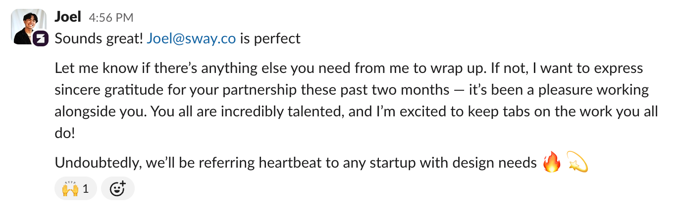
Not our words - theirs


We never ask for a list of deliverables
We don’t ship lists. We ship what makes sense — when it makes sense. Here’s how we actually work:

launch sprint
A focused design push to turn your early-stage vision into a sharp, fund-ready presence. From identity to product or site — we build what moves the needle now. Aligned, scalable, and ready to rally your team and audience.
Starts from $40K

next-level rebrand
Refine how series-a/b products present themselves to users & investors
scalable brand system
product ui patterns & motion
rollout playbook

design impulse
Senior design support that keeps your product and marketing consistently sharp
ui & marketing assets on tap
bi-weekly reviews
continuous visual qa
The process
Your product. Your team. What's strong. What's missing. We find the gaps fast and close them. That's the process.
The team
top-tier visual designers, awwwards jury creative director.
worked together for 11+ years
our design system .pulse is listed among IBM, Atlassian, Adobe at "Awesome Design Systems"
the total investment amount of the companies we worked is around $1+ bn.
look at our latest blog posts
Selected Clients
Series B, $15M raised
digital learning platform
Series B, $60M funding
AI for healthcare interactions
Series F, $325M funding
graph database platform
$3B stablecoin issuer
digital asset infrastructure
Series A, $11M raised
wealth management platform
bootstrapped cybersecurity firm
white-hat security services
Series B, $73M raised
telecom-as-a-service platform
Series A, $19M funding
attack surface management
Series A, $12M funding
customer-facing analytics
Series A, $66M raised
blockchain infrastructure
YC-backed, seed stage
social trading platform
Series D, $50M funding
neobanking for SMEs
Ready to build with clarity?
let’s align your product with who it really is — and who it’s becoming.